
Improving Android’s Main Menu design (and part of the Home Screen)
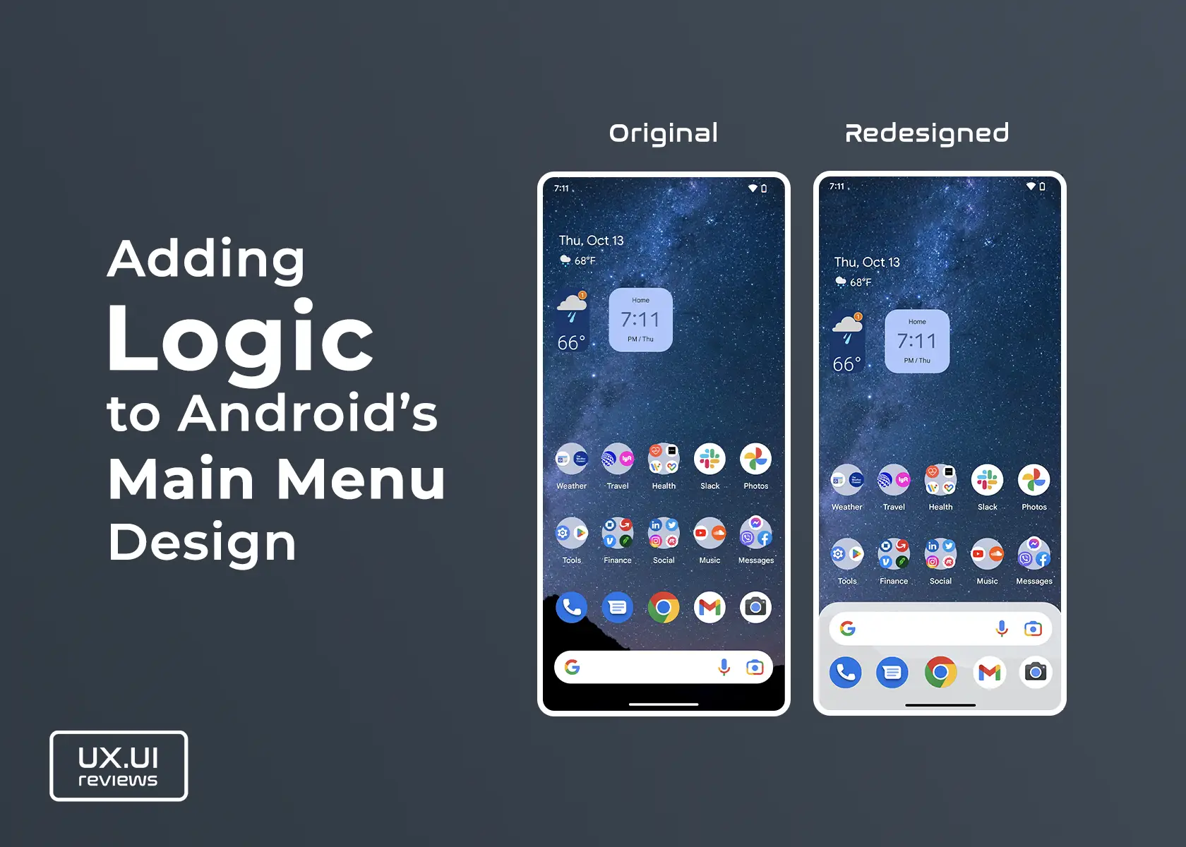
The main menu on Android devices is unique and nicely designed, and it’s been improving by incorporating the search bar as part of the home screen and the main menu. However, getting to it from the home screen could be improved. The user interface can be designed better to match its functionality, behavior, and animations.
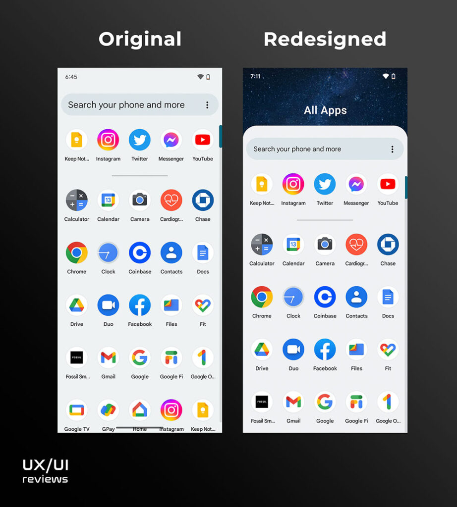
To improve the user experience of accessing the main menu, the bottom part of the screen should be slightly redesigned. That includes rearranging the search bar and the main app icons and introducing background colors and shapes that match the functionality and user motion.
For instance, to go to the main menu, users swipe up over the search bar or from anywhere on the screen. However, the current UI design does not indicate the intended behavior. The main menu appears kind of from the middle of the screen; it comes from nowhere – not following the user’s motion. Then, the search bar from the home screen is part of the menu and functions the same, but it is a new search bar.
Redesign the bottom part of the home screen
Because the search bar sits at the top when the main menu is launched, it should be positioned in the same way when at home screen – meaning above the top apps. To indicate that there is more below, a background color with rounded top corners that matches the background color of the main menu should be introduced. The top rounded corners indicate that there is more to this section, leading users to scroll up.
Positioning the search bar a little higher on the screen would make it sit right where the thumb naturally sits on the screen.
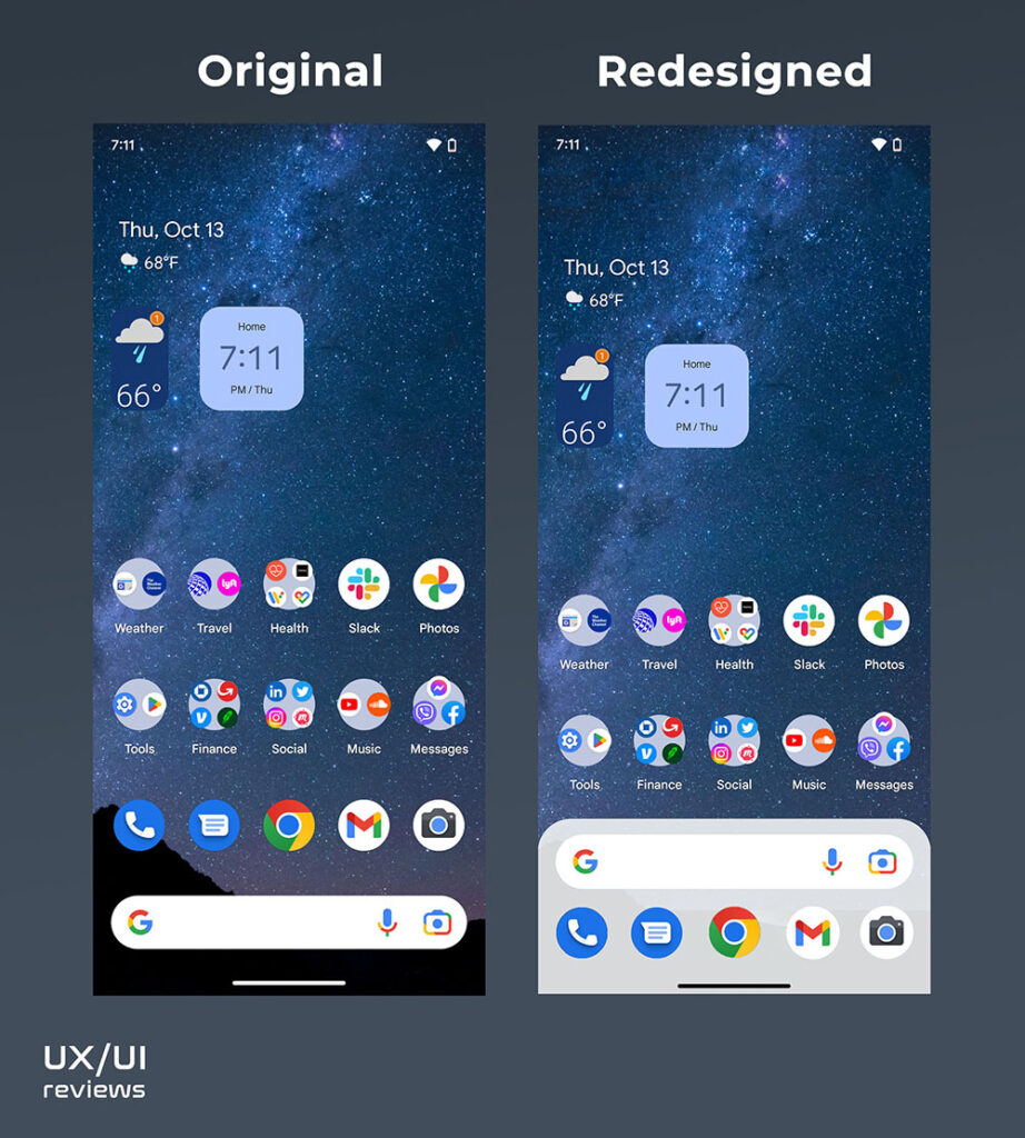
Finally, when the main menu is fully launched, I don’t think it should go all the way to the top of the screen; that would make reaching the search bar easier and indicate that to hide the main menu, users need to swipe down.