


Chrome VS Safari in Android and iOS – a UX Comparison
In this blog we are going to review and compare the Safari browser in iOS versus Chrome in Android. We are going to show how they are different, where they perform better in terms of UX UI and where they fall behind compared to each other.
Starting page
When you first open each browser, if you have no open websites, which probably is never the case, both browsers have somewhat a similar layout: icons of most visited websites or favorites, organized in 4 columns, and the address or search bar. Chrome, being a Google product, has its search bar positioned just above the middle of the screen, resembling Google on the web, whereas Safari’s address bar is at the bottom of the screen by default – and that is the most significant difference between the two browsers. We will talk more about this positioning and design, and what it means for the user’s experience in just a bit.
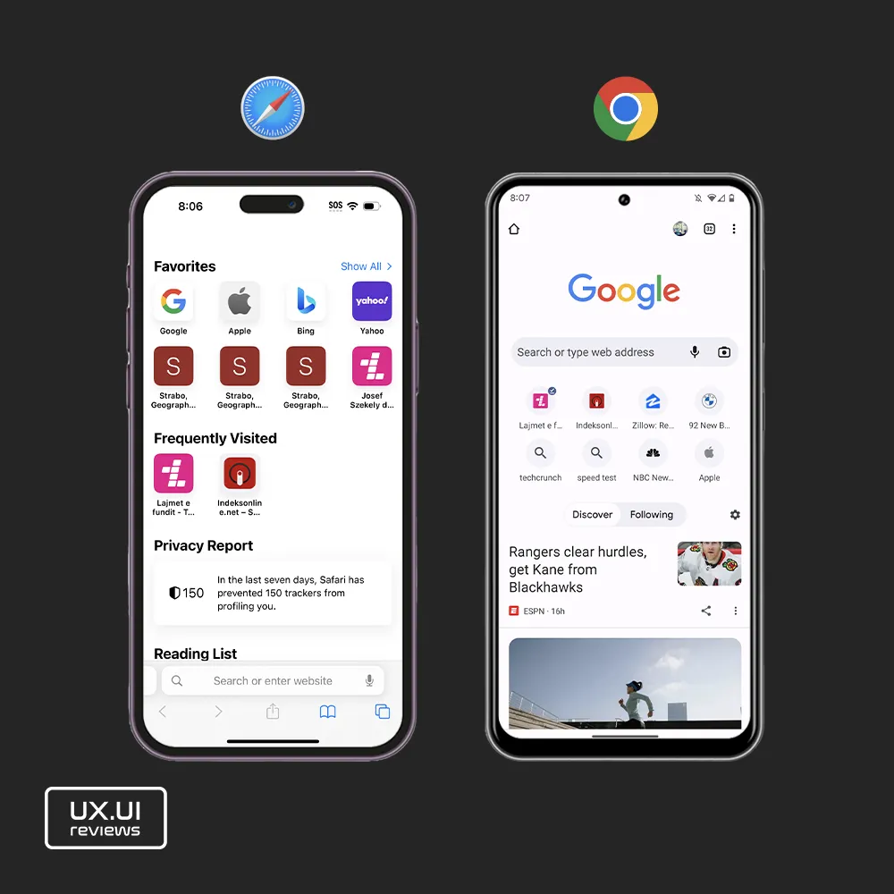
At the top, Chrome’s starting page, on the left side has a home screen icon that does nothing, and on the right side it has a users picture, number of tabs square icon, and the 3 dots icon for more options and setting of the browser. Below the search bar and the 8 icons of the most visited websites, chrome has trending news stories organized into two groups: Discover and Following.
On the other hand, Safari has 3 rows of favorite website icons, below it has a section of frequently visited websites, then a privacy report section and a reading list section under that, and then the address bar. Finally, under the search bar, at the very bottom of the screen Safari has the main control buttons of the browser that include going back and forth arrows, the sharing or options icon, the reading icon and the tabs icon.
Takeaways
- Icons bigger in iOS, a little too busy
- Safari better options in starting page by providing Favorite pages and Frequently visited
- Search bar better positioned in Chrome’s starting page
- Home icon in chrome, redundant
- Chrome – number of tabs – good information User Experience
When browsing
Like we said above, the biggest difference between the two browsers is the positioning of the address bar and the control buttons; in Chrome they are positioned at the top of the screen and in Safari they are positioned at the bottom, by default. The good thing in Safari is that you can actually move the address bar at the top.
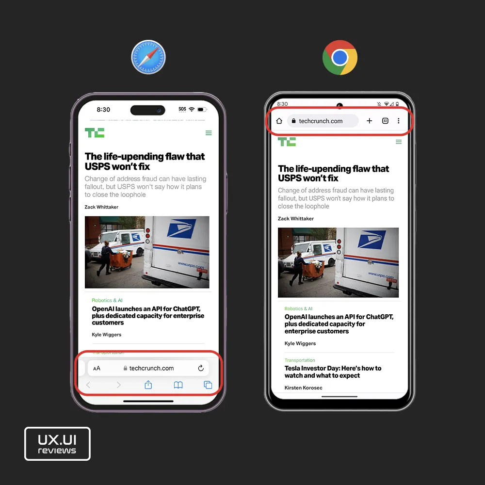
Because the top of the screen lines up naturally where a users eyes sit on the screen, and because users might cover the bottom of the screen of their phone and it’s easier to reach that part of the screen, Apple does a good job by positioning the address bar at the bottom of Safari and using the top of the screen for actual content. That becomes even more important with all the notches, cameras and islands on our smartphones that take good portion of smartphone screens. Another small difference related to the address bar and the browser controls is that, in Safari the address bar has a dedicated space for control buttons for navigating pages and browser options. On the flip side, in Chrome’s case, Google does a good job combining the address bar with the control buttons and by displaying only a few of the controls. In Chrome, in the same space you you have a home button that takes users to the starting page, then the address bar that is as wide as half of the screen, then a plus icon for opening a new tab, a square icon with the number of existing tabs that lets users brows open tabs, and then the three dots for more browser and page options. However, reaching for the search bar or the controls at the top of the screen in Chrome is quite of a stretch for the thumb.
A similar behavior of both browsers is that they both hide or shrink the address bar or controls when scrolling down for more content. While in chrome the address bar hides completely, in Safari the only the control hide while the address shrinks to a smaller size, creating a great user experience by keeping the user informed about the website they are browsing and making it easy to click and change the web address without having to scroll back up for the address bar to appear.
Takeaways
- Safari better positioning of the address bar by default
- Safari, flexibility in positioning the address bar
- Chrome, good job on combining address bar and controls, keeping it minimal and logically organized
- Chrome, home icon is confusing, is it home for the browser or home of the current browsing website
- Chrome, number of open tabs, good informative design
- Chrome, plus icon to open a new tab in one click
- Chrome, nicely organized all options and settings
- Safari, a few clicks to open new tab
- Safari, good back and forth control buttons
- Safari, confusing options because more options in aA icon within the search bar
Navigation, Options and Settings
Navigating both browsers is easy, in different aspects one browser performs better than the other. For example, in chrome it’s easier to open a new tab with only one click. You can also open a new tab by sliding left over the address bar in Safari but only when you are on the last tab, otherwise you’d have to go to all tabs and then open a new one using the plus icon.
Both browsers let users scroll through open tabs by swiping over the address bar, however this design is more intuitive in Safari because it shows a portion of the address bars of open tabs to the left and right.
Moving back and forth on a page is also a little easier in Safari. The back and forth buttons are at the bottom of the screen, and users can also swipe from the edge of the to go back and forth. In Chrome you use the system controls to go back, and to go forward on a page users have to go to more options and hit the forward icon. Speaking of options, Chrome does a better job by putting all of them under one button and grouping based on functionality. Safari on the other hand has two buttons for options, the sharing icon in the middle and the aA icon inside the sidebar. Then the reading icon shows bookmarks, favorites and history, but to add a website to any of these categories users have to click the sharing icon. Additionally, when pressing the sharing icon it only shows sharing options, users have to swipe up over these options to see more, adding more maneuvers for users.
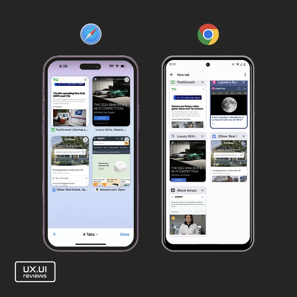
Finally, browsing and viewing all tabs is almost the same in both browsers – open tabs are displayed in two columns with previews of the page. Viewing all open tabs in Safari might be slightly a better experience. Safari has a bigger space between row tabs making the view more relaxed, and also it uses shadowing around the tabs compared to border in Chrome, again providing a more relaxed view. Additionally, when viewing all open tabs, in chrome the new tab button is in top left corner which is the furthest corner to reach in a devices screen, and Chrome doesn’t show the total number of tabs as Safari does at the end of the screen, and it doesn’t have a tab searching functionality in this view.
A bonus feature in Safari is allowing users to zoom on pages.
Takeaways
- Chrome, easy to open a new tab (point above)
- Safari, Back and Forth easier
- Safari, confusing options controls, disorganized options
- Safari, better UX design when browsing all open tabs