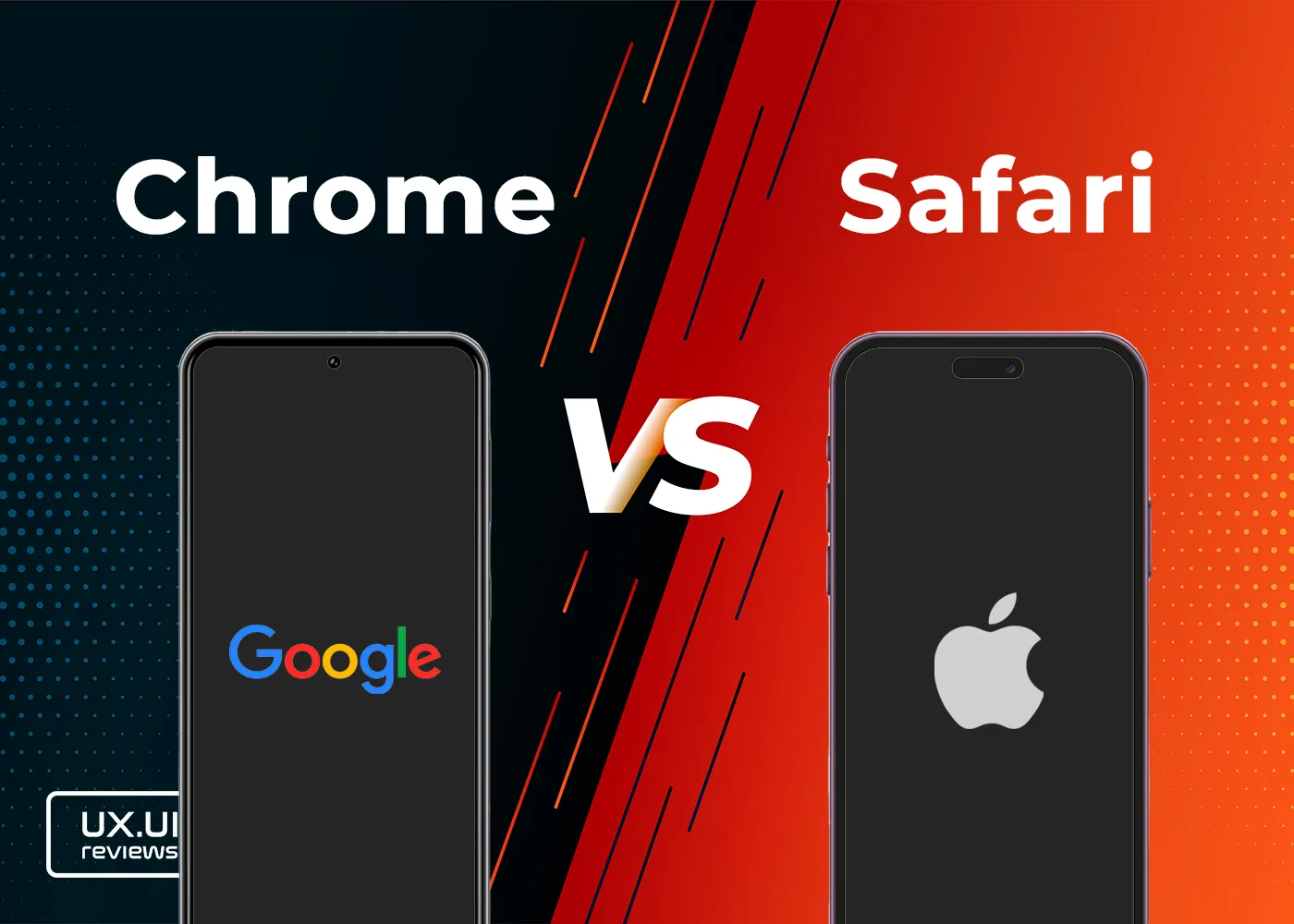
What Does WearOS Look Like and How it Works – on a Fossil 6 Smartwatch
What does WearOS on Fossil Watch 6 look like, how do you operate it and how do you configure it? In this blog we are going to talk about some of main interfaces of WearOS such as Faces, Menu, Tiles,…
6 Confusing iOS Designs
Have you ever struggled to delete a contact on your iPhone? Chances are, you may have encountered some poor design decisions in iOS. In this article, we'll be taking a closer look at eight such examples and how they impact…
The poor UX design of Low Battery notification in iOS
Imagine you are watching a video, playing an action game, or using maps for navigation while driving and suddenly be interrupted by a notification that blocks any of these activities. In fact, once I was riding my motorcycle on the…
Android’s Quick Settings Access is Boring and Poorly Designed
The control center is probably one of the interfaces users interact with the most. That is especially true for Android-based devices because of the fact that the Control Center is part of Notifications. The Control center in Android allows users…