Android’s Quick Settings Access is Boring and Poorly Designed
The control center is probably one of the interfaces users interact with the most. That is especially true for Android-based devices because of the fact that the Control Center is part of Notifications.
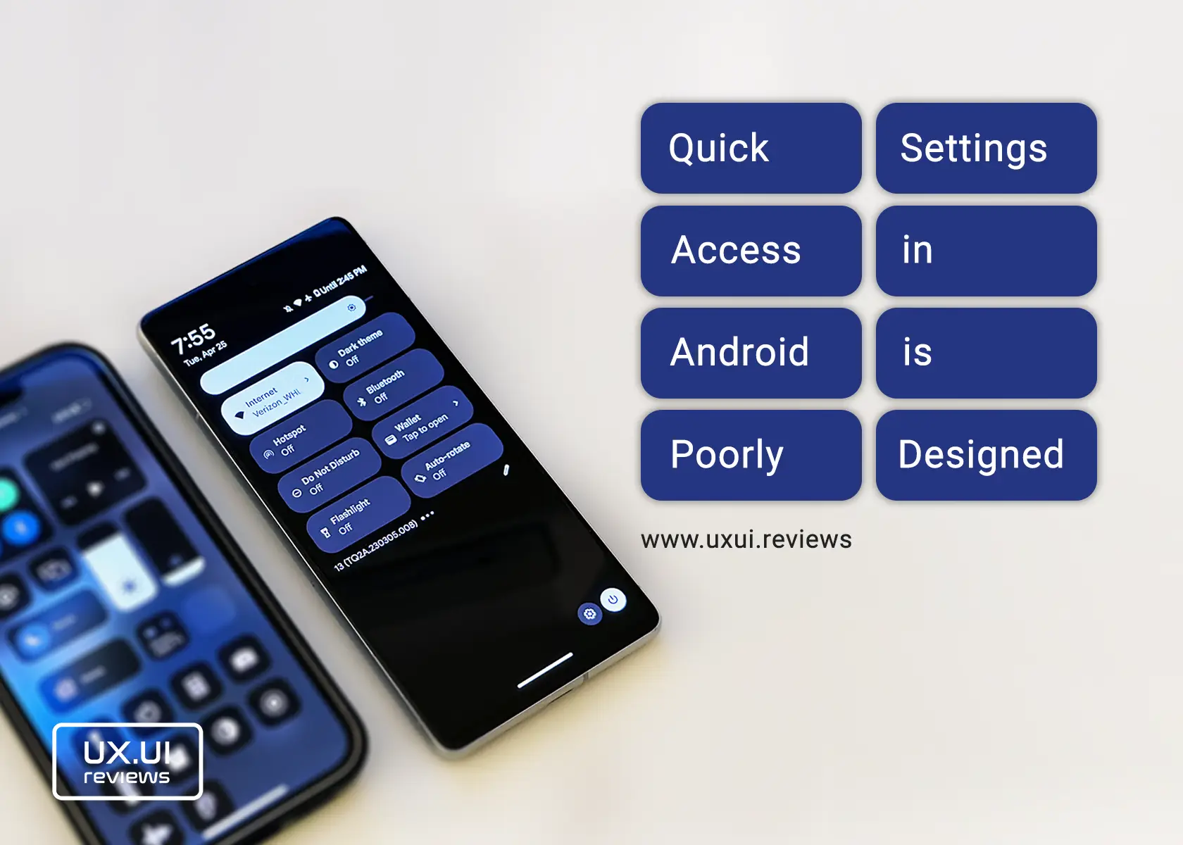
The Control center in Android allows users to quickly control some of the most important settings of a device. These controls include WiFi, Bluetooth, Flashlight, Silent modes, Alarms, Auto Rotate, Hotspot, Dark Theme, Calculator, and many more. To access the control (or notification) center, users swipe down from the top or anywhere on the screen when no application is active.
Control Center in Android looks Dull
Shapes and Design
With uniform tiles, the same size, shape, and coloring, the control center in Android provides a boring user experience. It makes it challenging to find the settings you are looking for. The lack of colors, different tiles shapes, and too much space around the text make the control center look very displeasing. Control tiles (buttons) look as if they were purpose-designed for a manufacturing environment interface and not for one of the most used smartphone operating systems.
The controls’ positioning is also not set for the best user experience. For example, when you first pull down the controls, they are positioned at the top of the screen, which is a more difficult part of the screen to reach. Another control that stands out is the brightness. This one sits at the top of the controls, and because it is a sliding one, the user must reach the screen’s furthest sides. Its design also leaves room for improvement; the line behind it almost serves no purpose and doesn’t match any other design elements.
Finally, there is a lot of space in the notifications area under the controls; that space is huge when there are no notifications.
Behavior
The behavior of the control center is also a poor experience. When a user first pulls down the controls, only four settings appear. If a user wants to see more controls, they have to slide down again for four more controls to show up and the brightness slider. However, there is no sign of more controls or that the user is supposed to slide down again.
On the second swipe down, when eight controls appear, and notifications no longer show, an option to slide right for more controls appears – adding another click/interaction. At the same time, 1/3 of the screen at the bottom is still empty.
An intuitive behavior in the control center is that when your device is locked and there are notifications, if you swipe down from the top of the screen, Android takes you to the eight controls instead of showing some controls and notifications.
Interestingly, there is no setting for configuring the control center under all settings.
What could be improved
Including more controls in one screen or swipe would lead to fewer interactions. Organizing controls based on background and icon colors or tile shapes would make focusing more effortless and appealing. Removing some text would help to make tiles less busy; for example, the Flashlight doesn’t need a title; it’s easy to tell what it is from the icon. It also doesn’t need the helping text to show if the Flashlight is on or off; that’s why the tile background color changes when one of these settings is active. Reducing some of the space within tiles would make them look more elegant. Moving the brightness slider to the bottom of the control would make it easier for users to adjust it.
Finally, use the space at the bottom of the screen by bringing the control center to the middle of the screen.