


The poor UX design of Low Battery notification in iOS

Imagine you are watching a video, playing an action game, or using maps for navigation while driving and suddenly be interrupted by a notification that blocks any of these activities.
In fact, once I was riding my motorcycle on the highway while using Google Maps on my iPhone 11 for navigation, and this notification popped right above my next turn. I was going somewhere for the first time and wasn’t sure where I needed to exit the highway. While I still could see most of my screen, it made it difficult to see the next maneuver.
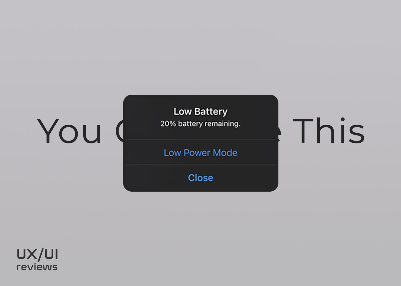
What is the Low Battery notification in iOS?
The Low Battery notification in iOS is a pop-up dialogue box that appears once your device’s battery level has decreased to 20% and appears again at 10%.
This design isn’t considered an intuitive UI because it stops users from an activity, creating an unpleasant user experience (UX) – perhaps a dangerous one at times.
The problem with the low battery interface is that it doesn’t go away until you press the close button or the button to enable Low Power mode. It almost seems like a piece of software or function forgotten in the iOS updates.
What could be the solution?
The low battery notification could be a regular notification appearing from the top of the screen – just like third-party app notifications. Interestingly, when your iOS is locked, the notification doesn’t appear on your screen, which makes me think that is a forgotten feature in Apple’s iOS development.
Another fact to consider is that 20% is still a lot of battery. One of the solutions could be that at 20%, the pop-up notification disappears automatically after 3 seconds, let’s say, or it could be a regular notification from the top of the screen. Then at 10%, which is a critical battery level, the notification could be a pop-up as it is now that you need to take action to make it go away.
Finally, I think this battery notification could be a bit smarter like if you are playing a video or you are using navigation apps, it wouldn’t blob onto your screen and interrupt your activity.
This Post Has One Comment
[…] (7)BONUS: The Low Battery notification in iOS […]
Comments are closed.