6 Confusing iOS Designs

Have you ever struggled to delete a contact on your iPhone? Chances are, you may have encountered some poor design decisions in iOS. In this article, we’ll be taking a closer look at eight such examples and how they impact the user experience.
1
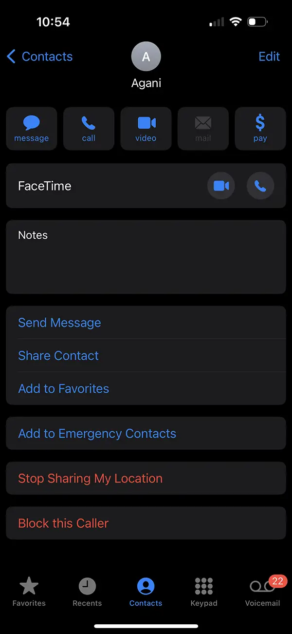
Deleting a Contact
When it comes to deleting a contact, the process is not straightforward. Instead of having a dedicated “Delete” option next to other contact options, users have to edit the contact and then delete it. This can be confusing and time-consuming.
2
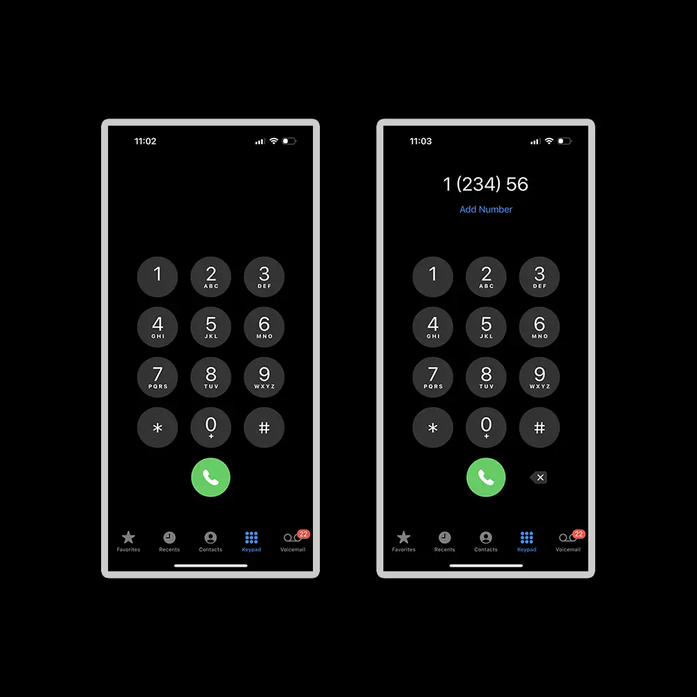
The Minimalist Keypad
The keypad on an iPhone is too minimalistic. It lacks a clear field or indicator where the typed numbers will appear. Additionally, there’s no option to select individual numbers, making it difficult to send a message to a number that’s not in your contact list, or simply copy pasting selected numbers.
3
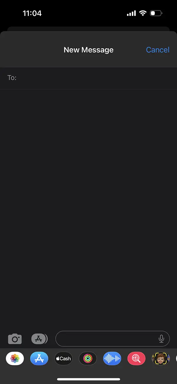
 Efficiently Sending Messages to Numbers
Have you ever struggled to send a message to a number that isn’t saved in your contacts? If so, you’re not alone. Unfortunately, the current design of the iPhone’s messaging app doesn’t make it easy to send messages to numbers that aren’t saved as contacts.
4
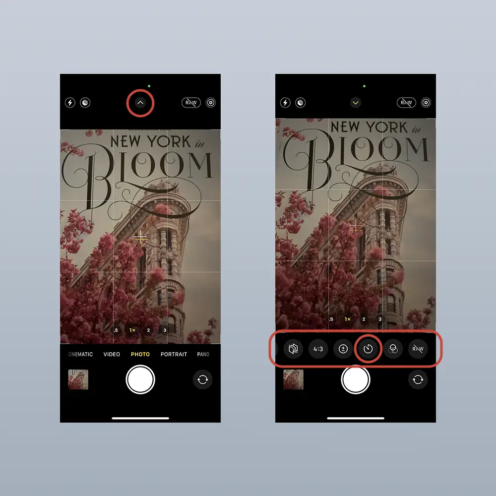
Finding the Timer on the iPhone Camera
Good luck finding the timer in camera, and if you guess it, it is the arrow at the top of the screen that displays more option icons at the bottom of the screen that could easily be covered by your thumb while you are trying to reach the top of your screen. The arrow for more options could be positioned next to the 1x, I mean 1x the zoom and 16:9 ratio are related, or the contrast.
5
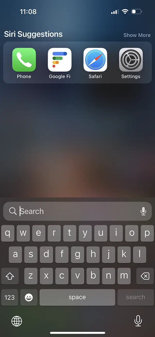
Ambiguous Swipe Down to Search
The swipe down to search feature in iOS is visually unappealing and unclear. It doesn’t provide any context about what you can search for, making it less user-friendly. A more informative prompt, such as “Search for anything: web, files, photos, messages, contact, etc.” would be more helpful.
6
 Same Options and Sharing Icon
The options or sharing icon in iOS is not intuitive. Its design makes it appear as if it means “send” or “open” something, but in reality, it provides more options along sharing possibilities which appear first. This can be confusing for new users who are still learning the ins and outs of iOS.
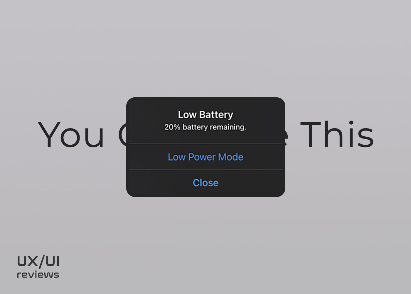
(7)BONUS: The Low Battery notification in iOS
These are just a few examples of poor user experience designs in iOS. Although Apple is known for its sleek and user-friendly products, these design choices detract from the overall experience. With these suggestions in mind, it’s clear that there’s room for improvement in the way iOS handles contacts, keypads, search, camera timer, and options.